Project Overview
Background
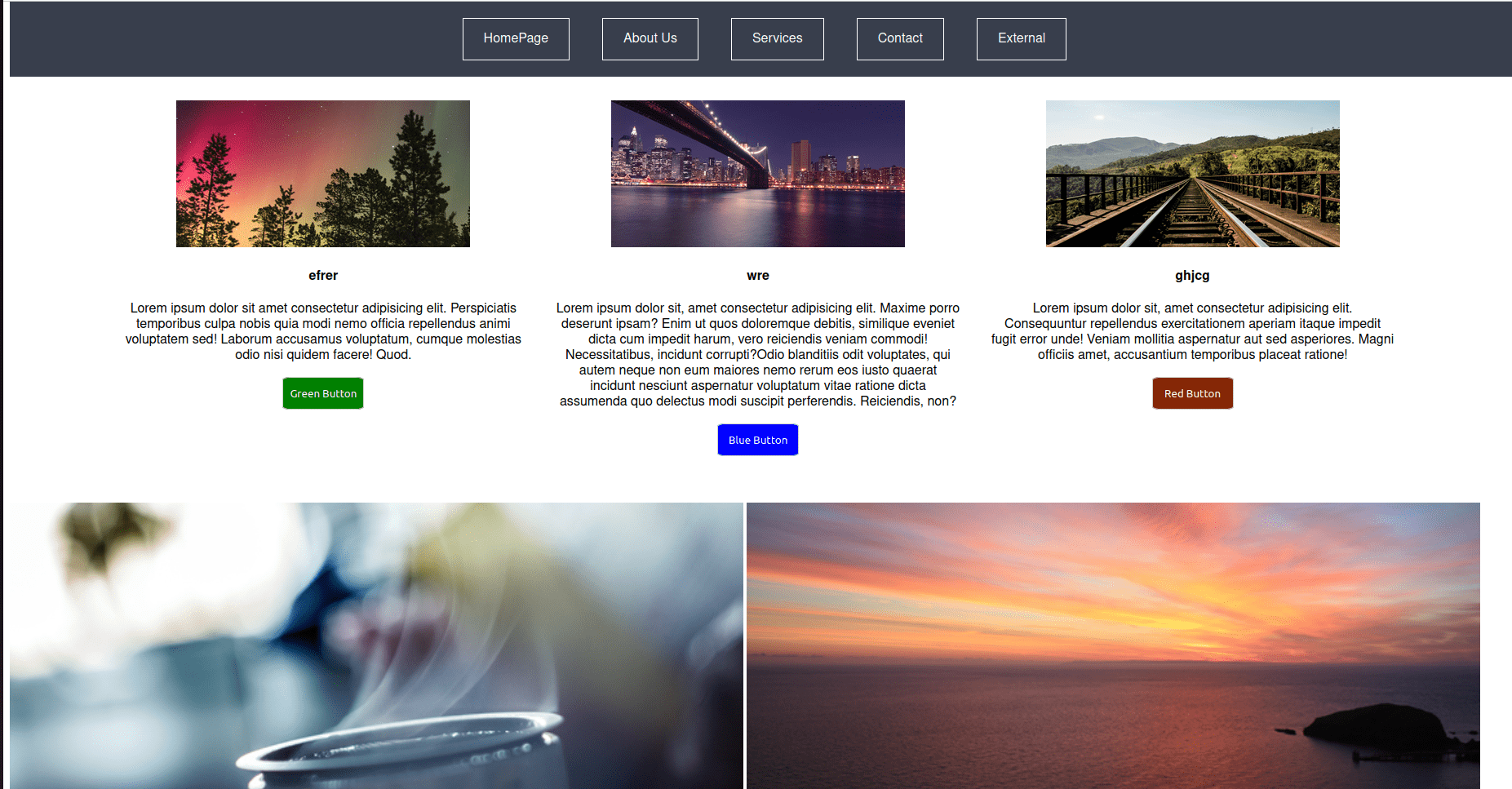
The Conquer Landing Page, hosted at https://danishmanhas.github.io/Conquer/, is a web development project designed to create a captivating and informative landing page for a fictional product or service. The page aims to showcase the product’s features, benefits, and brand identity, with a focus on attracting and engaging visitors.
Motivation
The primary motivation behind this project is to demonstrate the ability to create an effective and visually appealing landing page that can capture the attention of potential users or customers. The project emphasizes the importance of design, user experience, and compelling content to convey the value proposition of the featured product.
Features and Functionality
1. Responsive Design
The landing page is designed to be responsive, ensuring a seamless and visually pleasing experience across various devices and screen sizes.
2. Visual Elements
-
Hero Section: A visually striking hero section with captivating imagery and a concise tagline to immediately grab the visitor’s attention.
-
Feature Highlights: Sections highlighting key features and benefits of the product/service, accompanied by relevant images or graphics.
-
Call-to-Action (CTA): Clear and strategically placed CTA buttons prompting visitors to take desired actions, such as signing up, exploring more, or making a purchase.
3. Navigation
The navigation is intuitive, allowing visitors to easily explore different sections of the landing page and quickly access relevant information.
Technologies Used
Frontend
- HTML, CSS, JavaScript: Core technologies used for creating the user interface, implementing interactive elements, and ensuring a responsive design.
Design and User Experience
Visual Design
The Conquer Landing Page boasts a visually appealing and cohesive design, incorporating a consistent color scheme, typography, and imagery to convey a brand identity.
User Interaction
-
Scrolling Animations: Smooth scrolling animations and transitions add a layer of interactivity, enhancing the overall user experience.
-
Interactive Elements: Engaging elements, such as hover effects on buttons and interactive graphics, contribute to a dynamic and immersive experience.
Challenges and Solutions
1. Visual Cohesion
Maintaining visual cohesion across different sections while incorporating diverse content posed a challenge. The use of a consistent design language and color palette addressed this challenge, ensuring a unified and visually appealing presentation.
2. Responsiveness
Ensuring a seamless experience on various devices required careful consideration. Responsive design principles, including media queries and flexible layouts, were employed to optimize the page for different screen sizes.
Future Improvements
-
Analytics Integration: Implementing analytics tools to track user interactions and gather insights for further optimization.
-
A/B Testing: Conducting A/B testing to experiment with different elements and determine the most effective design and content variations.
Conclusion
The Conquer Landing Page project is a testament to the ability to create an impactful and visually appealing web presence for a product or service. The attention to design details, user experience, and responsiveness showcases a commitment to delivering engaging and effective digital experiences. As the project evolves, it continues to embody the dedication to crafting landing pages that effectively communicate and resonate with the target audience.
